If It Ain’t Broke, Fix It Anyway
A Retrospective on Proactive Rebranding
It’s 2016 and Instagram has just released their annual report, boasting some staggering numbers including 12 million new users introduced to the platform the year before. They also reported over $1 billion in revenue. Things were going great for the social pl — BUT WAIT!

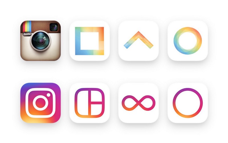
On May 11th of that year, Instagram ditched the old branding, an iconic stand-out among the sea of other apps on the phones of 57 million people.
Why Would They Do This?
To understand their reasoning, we need to go back even further to 2013. To emphasize the drastic improvements of iOS 7, Apple redesigned their icons, accomplishing a sleeker flat design look.

iOS 6 vs iOS 7 comparison
Most third party apps quickly redesigned their own icons to fit in, but Instagram took their time. Over the next 3 years, Instagram learned from the redesigns of other apps — their successes and failures.
They also realized that their app was growing at an immense speed. It wasn’t just a photography app anymore and their identity had to represent this. Analytics, Stories, live videos, and direct messaging — Instagram had transitioned into a social media giant.
“Instagram’s Polaroid-y logo was always too on-the-nose and overly ironic for the world’s biggest photo and video sharing app, and I think the change came at just the right moment.” — Josh Scherer, Los Angeles Magazine
The redesign also filled the need to better tie together its sister apps into a cohesive visual family. Today, Instagram, Layout, Boomerang, and Hyperlapse are all evidently part of the same crew, proudly flying their iconic gradient flag!

Not all design changes have to be big. In 2013, MailChimp had added 2.4 million new users to their platform. The email marketing tool was growing at an incredible pace, but still, their word mark wasn’t very easy to read and diminished the strength of the platform. Something had to be done.

“Overall the weight was lightened, the vector drawing improved, and letterforms were revised for legibility, especially at small sizes. The end result is something new and fresh, more refined but just as playful.” — Jessica Hische, Designer of the MailChimp word mark
Decide for yourself: which one is easier to read at smaller sizes?

When Should You Make a Change?
Just like other elements of your brand, your logo may need to be revised and updated at times.
It’s not just about waiting until your sales start to slip. Done right, a redesign — or simply a refresh — has the ability to completely revolutionize a brand.
There are some telltale signs that your brand might need to revisit its brand identity.
- Changes in the market landscape: Keep a close eye on what your competitors are doing and how brand identity expectations are evolving.
- Keeping up with design trends: Aesthetics change all the time. From the bright colours of the 80s to the minimalist designs of today, it’s important to maintain a look that aligns with your consumer preferences.
- Company changes: Companies are evolving so quickly — through their people, culture, products, etc. — that the brand personality and design needs to change frequently to keep but, but often lags behind.
- New marketing trends: Your logo should be adaptable enough to fit social media profiles, websites, and other modern marketing tactics.
- Consumer changes: It’s important that your brand appeals to the ever-changing consumer mindset. To maintain a pulse on exactly how the target market behaves, organizations develop consumer personas — various identities that detail exactly how different types of consumers interact with the brand.
It’s important to realize that the most successful companies in the world are never content with their operations. Companies like MailChimp and Instagram are always evaluating themselves and their surroundings, looking for opportunities to improve. When’s the last time you looked at your brand?
